Introduction
A landing page is where clicks meet conversions — the bridge between curiosity and commitment. Whether it’s a paid ad, an email campaign, or a social media promotion, your landing page determines whether your audience takes the next step. But not all landing pages are created equal.
A high-converting landing page isn’t just about great design — it’s about psychology, structure, copy, and user experience working together seamlessly. In this guide, we’ll dissect every key element that makes a landing page convert, and explain the why behind each design and content choice.
1. What Is a Landing Page?
A landing page is a standalone web page created for a specific marketing campaign or goal — such as generating leads, selling a product, or driving event signups. Unlike your homepage, a landing page has a single, focused objective and one clear call-to-action (CTA).
Types of Landing Pages
-
Lead Generation Page – Gathers information like emails or phone numbers.
-
Click-Through Page – Warms up visitors before sending them to another conversion page.
-
Sales Page – Directly sells a product or service.
-
Squeeze Page – Short and to the point, focused on email capture.
-
Webinar or Event Page – Encourages signups for a specific event.
-
Thank You Page – Confirms conversions and offers next steps.
2. The Psychology Behind Conversion
Every high-performing landing page leverages behavioral psychology. You’re not just convincing users — you’re aligning with how their minds naturally make decisions.
Key Psychological Principles:
-
Social Proof: People follow the actions of others (testimonials, reviews).
-
Authority: Expert endorsements and certifications build credibility.
-
Loss Aversion: Highlighting what users might lose by not acting can drive urgency.
-
Reciprocity: Offer value (like a free guide) before asking for something in return.
-
Anchoring: Present the higher-priced option first to make other options seem more affordable.
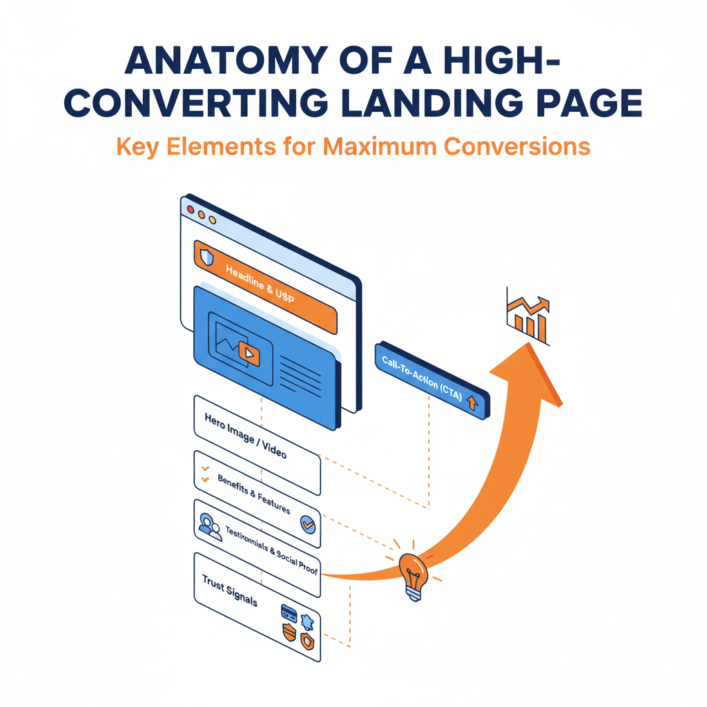
3. Essential Components of a High-Converting Landing Page
Let’s break down each section — the anatomy of conversion.
(a) Compelling Headline
Your headline is the first thing visitors notice — it decides whether they’ll stay or bounce.
Tips:
-
Make it clear, not clever.
-
Focus on value and benefit, not features.
-
Keep it short (8–12 words).
-
Use action-driven language: “Get”, “Discover”, “Unlock”, “Start”.
Example:
“Get 2x More Leads Without Increasing Your Ad Spend.”
(b) Subheadline (Supporting Statement)
The subheadline clarifies your promise and provides additional motivation to keep reading.
Example:
“Our AI-powered platform helps you identify and convert high-intent visitors in real-time.”
(c) Hero Image or Video
Visuals create an instant connection.
Use images that reflect your product in use or the emotional benefit your service provides.
Tips:
-
Avoid generic stock photos.
-
Use short explainer videos (30–60 seconds).
-
Keep file sizes small for fast loading.
(d) Value Proposition
This is your “why”. It answers:
👉 Why should someone choose you over competitors?
Formula:
[Product/Service] helps [Audience] achieve [Result] without [Pain Point].
Example:
“Our email automation software helps small businesses boost conversions without complicated setups.”
(e) Call-to-Action (CTA)
Your CTA is the climax of your page.
It must be visible, specific, and emotionally compelling.
Best Practices:
-
Use contrasting colors to make it stand out.
-
Place it above the fold and repeat throughout the page.
-
Use action + benefit language (e.g., “Start My Free Trial,” not “Submit”).
CTA Examples:
-
“Get Started Free”
-
“Book My Demo”
-
“Claim My Discount”
-
“Join the Waitlist”
(f) Trust Indicators & Social Proof
People trust people more than brands.
Build confidence through:
-
Customer testimonials (with names and photos)
-
Case studies or success stories
-
Ratings (e.g., “4.9/5 based on 2,000+ reviews”)
-
Client logos or partnerships
-
Media mentions or certifications
Example:
“Trusted by 10,000+ marketing teams worldwide.”
(g) Benefits & Features Section
Don’t just tell users what your product does — show them what’s in it for them.
Format:
-
Start with 3–5 benefits, not just features.
-
Use icons or visuals for clarity.
-
Include mini CTAs under each benefit if possible.
Example:
| Feature |
Benefit |
| Automated Reports |
Save 10+ hours weekly |
| Real-Time Alerts |
Never miss a conversion opportunity |
| AI Optimization |
Get better ROI automatically |
(h) Visual Hierarchy & Design
A high-converting page uses design psychology to guide the eye toward the CTA.
Design Tips:
-
Keep layouts clean, uncluttered, and consistent.
-
Use F-pattern or Z-pattern layouts for readability.
-
Maintain ample white space.
-
Use contrasting colors for key buttons.
-
Make sure it’s mobile-responsive (most users browse on phones).
(i) Scarcity & Urgency Triggers
Creating time-sensitive incentives can nudge users toward faster action.
Examples:
⚠️ But avoid false urgency — authenticity is key.
(j) Form Optimization
Your form can make or break conversions.
Each extra field reduces signups by ~10%.
Tips:
-
Ask only what’s necessary.
-
Use progressive forms (collect info in steps).
-
Clearly state privacy policies (“We never spam you”).
-
Enable auto-fill and mobile-friendly input fields.
(k) Post-Conversion Experience
The journey doesn’t end with a click.
After Conversion:
-
Show a thank-you message.
-
Offer next steps (download, calendar booking, upsell).
-
Send a confirmation email immediately.
A smooth post-click experience builds trust and retention.
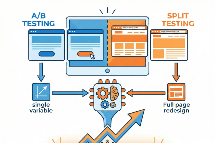
4. Optimization Through CRO (Conversion Rate Optimization)
Once your landing page is live, data-driven optimization keeps it improving.
Test & Analyze:
-
A/B Testing: Try different headlines, CTAs, or designs.
-
Heatmaps: See where users click or drop off.
-
Session Recordings: Observe real behavior.
-
Analytics: Track bounce rate, scroll depth, and conversion paths.
Metrics to Track:
5. Common Landing Page Mistakes
Avoid these pitfalls:
❌ Too much text or clutter
❌ Confusing navigation (landing pages should be standalone)
❌ Multiple CTAs (causes decision fatigue)
❌ Slow load times
❌ No mobile optimization
❌ Weak or generic headlines
6. Real-World Examples of High-Converting Landing Pages
Example 1: Slack
-
Clean hero section with a strong headline.
-
Visuals showing collaboration.
-
Simple CTA: “Try for free.”
Example 2: Airbnb Host Page
-
Emotional storytelling with benefits.
-
Testimonials from real hosts.
-
Clear CTA: “Start Hosting Today.”
Example 3: HubSpot
-
Multiple CTAs throughout.
-
Smart use of color and whitespace.
-
Conversion-focused forms with minimal fields.
7. Bonus: Emotional Copywriting Frameworks
Use these copywriting formulas to increase resonance:
-
PAS (Problem–Agitate–Solve)
-
AIDA (Attention–Interest–Desire–Action)
-
FAB (Features–Advantages–Benefits)
-
Storytelling to create emotional engagement.
Conclusion
A high-converting landing page isn’t built — it’s crafted.
It’s the product of understanding your audience’s psychology, writing with purpose, designing with clarity, and continuously testing to improve.
When every element — from headline to CTA — works in harmony, your landing page becomes not just a destination, but a conversion engine that powers your entire marketing funnel.