
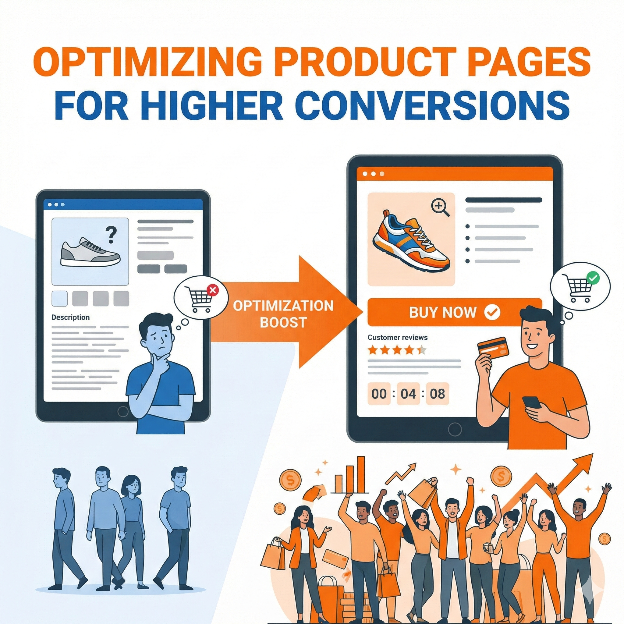
Optimizing Product Pages for Higher Conversions: The Complete Guide
Converting visitors into customers is the ultimate goal of any e-commerce business, and your product pages are where this critical transformation happens. A well-optimized product page doesn’t just display information—it persuades, reassures, and guides potential customers toward making a purchase decision. This comprehensive guide explores every aspect of product page optimization, from foundational principles to advanced tactics that can significantly boost your conversion rates.
Understanding the Psychology of Product Page Conversions
Before diving into specific tactics, it’s essential to understand what drives purchase decisions. When visitors land on your product page, they’re typically in one of several psychological states: curious, comparison shopping, ready to buy, or skeptical. Your product page needs to address all these mindsets simultaneously.
The human brain processes information through two systems. System 1 is fast, automatic, and emotional, while System 2 is slower, deliberate, and logical. Effective product pages engage both systems. Visual elements, social proof, and urgency triggers appeal to System 1, creating an immediate emotional response. Detailed specifications, comparison charts, and rational arguments satisfy System 2’s need for logical justification.
Trust plays an enormous role in online purchasing decisions. Unlike physical stores where customers can touch products and interact with salespeople, online shoppers must rely entirely on what they see on their screens. Every element of your product page either builds or erodes trust. Professional photography builds trust; pixelated images destroy it. Detailed product descriptions build trust; vague marketing language creates skepticism. Real customer reviews build trust; obviously fake testimonials trigger immediate rejection.
Crafting Product Titles That Convert
Your product title is often the first element visitors see, and it serves multiple purposes simultaneously. It must be descriptive enough for search engines, specific enough for customers, and compelling enough to maintain interest. The challenge lies in balancing these competing demands within limited character counts.
Effective product titles follow a hierarchy of information. The most important elements come first: brand name for branded products, or primary product category for generic items. Next comes the specific product type and key differentiating features. Finally, you include secondary attributes like color, size, or quantity that help customers identify exactly what they’re looking at.
Consider the difference between a weak title like “Blue Shoes” and an optimized title like “Nike Air Zoom Pegasus 40 Men’s Running Shoes – Navy Blue/White, Lightweight Cushioning.” The second title immediately tells customers the brand, specific model, product category, target audience, color, and key benefit. This level of specificity serves both SEO purposes and customer clarity.
However, titles can become unwieldy if you try to stuff too much information into them. The key is identifying which attributes matter most to your specific customers. For technical products, this might mean including model numbers and specifications. For fashion items, style names and materials might take priority. For consumables, quantity and flavor variants become crucial.
Product Images: Your Silent Salespeople
Product imagery arguably matters more than any other single element on your product page. Humans are visual creatures, and in the absence of physical interaction with products, high-quality images become the primary way customers evaluate what they’re buying.
The foundation of effective product imagery is quality. This means high resolution, proper lighting, accurate color representation, and sharp focus. Blurry or dark images immediately signal low quality, regardless of the actual product. Professional photography isn’t optional for serious e-commerce businesses—it’s a fundamental investment that directly impacts revenue.
Multiple images from different angles help customers build a complete mental model of the product. For clothing, this means front, back, side views, and detail shots of fabric, closures, and special features. For electronics, this includes ports, buttons, screens, and size comparisons with familiar objects. For furniture, room setting shots help customers visualize the product in their own space.
Zoom functionality transforms static images into exploratory experiences. When customers can zoom in to see texture, stitching, or fine details, it replicates the tactile examination they’d perform in a physical store. This capability particularly matters for products where quality and craftsmanship justify premium prices.
Lifestyle images complement product-only shots by showing items in context. A backpack looks nice on a white background, but showing someone wearing it while hiking communicates its size, capacity, and intended use far more effectively. These contextual images help customers imagine themselves using the product, which activates the powerful psychological principle of mental ownership.
Video content represents the next evolution in product visualization. A 360-degree video lets customers rotate products as if holding them. Demonstration videos show products in action, clarifying features that static images struggle to convey. Unboxing videos set expectations for the customer experience from the moment the package arrives. While video production requires more resources than photography, the conversion lift often justifies the investment.
Writing Product Descriptions That Sell
Product descriptions walk a fine line between providing necessary information and creating desire. The best descriptions educate while they persuade, answering practical questions while building emotional connection with the product.
Understanding your audience determines your descriptive approach. Technical buyers want specifications, measurements, and compatibility information. Emotional buyers respond to storytelling, lifestyle benefits, and aspirational messaging. Most products attract both types, so effective descriptions often use a layered approach—leading with emotional benefits, then supporting with concrete details.
Feature-benefit translation forms the core of persuasive product writing. A feature describes what a product has; a benefit explains what that means for the customer. “Breathable mesh upper” becomes “Keeps your feet cool during intense workouts.” “1000mAh battery” becomes “Powers your device for three full days between charges.” This translation requires understanding customer pain points and desires, then showing how your product addresses them.
Sensory language helps bridge the gap between digital and physical. Even though customers can’t touch products online, you can help them imagine the experience. “Buttery-soft leather,” “crisp cotton sheets,” “smooth matte finish”—these descriptions activate sensory memories that make products feel more real and tangible.
Addressing objections preemptively prevents cart abandonment. If customers typically worry about sizing, your description should detail the fit and suggest how to choose correctly. If durability concerns arise frequently, emphasize construction quality and materials. If complexity intimidates buyers, stress ease of use and setup. Your customer service team and reviews reveal common objections that descriptions should counter.
Scannable formatting acknowledges how people actually read online—they don’t. They scan for relevant information. Breaking descriptions into short paragraphs, using subheadings for different aspects, and employing bullet points for specifications all make information accessible to scanners while remaining readable for those who want details.
Pricing Psychology and Display
How you present prices significantly impacts purchase decisions, often more than the actual price itself. The field of pricing psychology reveals numerous tactics that can increase conversions without changing your actual prices.
Charm pricing—ending prices in 9 or 99—remains surprisingly effective despite being widely recognized. The left-digit effect means our brains perceive $19.99 as significantly cheaper than $20, even though the difference is negligible. This tactic works best for impulse purchases and lower-priced items, while round numbers can signal premium quality for luxury goods.
Price anchoring uses reference points to make your actual price seem more attractive. Showing a higher manufacturer’s suggested retail price creates a reference that makes your price look like a deal. Displaying your most expensive option first makes mid-tier options seem reasonably priced by comparison. Volume discounts anchor customers to higher quantities by making the per-unit savings explicit.
The way you frame discounts matters enormously. For items under $100, percentage discounts typically feel more substantial (“Save 25%!”). For items over $100, absolute dollar amounts create greater impact (“Save $50!”). The psychological reason is simple: bigger numbers feel more significant, so you want to present the discount as the bigger number.
Scarcity and urgency tactics tap into fear of missing out, but they must be authentic to maintain trust. If you genuinely have limited stock, saying so encourages faster decision-making. Time-limited sales create urgency, but only if customers believe the deadline is real. Fake countdown timers that reset for each visitor destroy credibility and can backfire spectacularly.
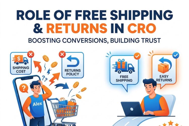
Displaying total cost transparency builds trust, even if it means showing higher numbers. Unexpected shipping costs at checkout are the top reason for cart abandonment. If you can’t offer free shipping, show the total cost including shipping as early as possible. If shipping varies by location, provide an easy way to estimate it on the product page itself.
Social Proof and Customer Reviews
Humans are social creatures who look to others when making decisions under uncertainty. Social proof—evidence that other people have purchased and approved of a product—significantly reduces purchase risk and increases conversion rates.
Customer reviews serve as the most powerful form of social proof. Studies consistently show that displaying reviews increases conversion rates, with the impact growing as review count increases. Even a small number of reviews is better than none, as it signals that real people have purchased and used the product.
Review authenticity matters far more than perfect ratings. Counterintuitively, products with exclusively five-star reviews can trigger skepticism. A few four-star or even three-star reviews actually increase credibility by demonstrating that the reviews are genuine. The key is overall positive sentiment with enough detail to be believable.
Review recency affects credibility differently depending on product type. For technology products, recent reviews matter most since products and software versions change. For classic products like basic clothing items or books, older reviews maintain relevance. Displaying the date of each review lets customers make these assessments themselves.
Responding to reviews, especially negative ones, demonstrates active customer care. A company that professionally addresses complaints shows potential buyers that problems will be handled if they occur. This transforms negative reviews from pure liabilities into opportunities to showcase customer service quality.
Photo reviews dramatically increase the impact of social proof. When customers upload their own photos of products in real-world settings, it provides authentic visualization that complements professional product photography. These customer photos often reveal how products look in normal lighting, how they fit real body types, or how they appear in actual homes—information that professional shots can’t convey.
Star ratings should be prominently displayed near the product title, as they influence first impressions. The specific average rating (4.3 stars) plus the total number of reviews (based on 127 reviews) provides both quality signal and credibility. High ratings with low review counts might be lucky flukes; high ratings with hundreds of reviews are statistically significant.
Beyond reviews, other social proof elements include customer count (“Over 50,000 customers trust us”), press mentions (“As featured in…”), awards (“Winner of…”), certifications, and expert endorsements. The key is matching the type of social proof to what your specific audience finds credible.
Technical Product Specifications
For many products, detailed specifications aren’t optional—they’re essential for the purchase decision. Technical buyers need to verify compatibility, compare options, and ensure products meet their requirements. The challenge is presenting this information in an accessible way that doesn’t overwhelm non-technical buyers.
Specification tables organize technical data efficiently. Rows for different attributes and columns for values create scannable references that technical buyers can quickly parse. Grouping related specifications under subheadings (Physical Dimensions, Performance Specs, Connectivity, etc.) helps users find specific information without reading everything.
Explaining specifications in plain language helps bridge the technical-knowledge gap. Not everyone knows what “802.11ac” means, but most understand “Fast WiFi that works throughout your home.” Providing both the technical term and a simple explanation serves both audience types. You might even use tooltips or expandable sections so technical buyers aren’t bogged down by explanations they don’t need.
Comparison charts help customers evaluate multiple options when you sell variants or related products. Instead of forcing customers to open multiple tabs and mentally compare specifications, a side-by-side chart clarifies differences. This is particularly effective for good-better-best product tiers, helping customers identify which option meets their needs without over-buying or under-buying.
Compatibility information prevents costly mistakes and returns. If your product works with specific systems, devices, or other products, state this explicitly. If it doesn’t work with common alternatives, mention that too. Incompatibility surprises are among the most frustrating customer experiences, leading to returns, negative reviews, and lost trust.
Visual specifications complement text for certain attributes. Size dimensions become clearer when shown on a human figure or next to familiar reference objects. Color accuracy improves when swatches show the actual product color rather than relying on possibly miscalibrated display screens. Weight feels more concrete when compared to something familiar.
Call-to-Action Optimization
Your call-to-action button represents the critical conversion moment, yet many product pages treat it as an afterthought. The button’s design, copy, and placement all influence whether visitors take the desired action.
Button visibility is fundamental. Your primary CTA should be immediately obvious without competing with other elements. Contrasting colors ensure the button stands out against the page background. Adequate size makes it easy to click on both desktop and mobile devices. White space around the button prevents accidental clicks while drawing attention to the button itself.
Button copy goes beyond generic “Add to Cart” when it can increase urgency or emphasize value. “Add to Cart” works fine, but “Add to Cart – Ships Today” emphasizes fast delivery. “Buy Now – 20% Off” highlights savings. “Reserve Yours Now” creates scarcity. “Start Your Free Trial” reduces risk for subscription services. The key is matching your button copy to your specific value proposition.
Multiple CTA placements accommodate different browsing patterns. Some visitors decide quickly and need an immediate CTA near the top of the page. Others scroll through all information before deciding, needing a CTA after the detailed description. Sticky CTAs that remain visible during scrolling capture impulse purchases at any moment without forcing users to scroll back up.
Micro-commitments offer lower-friction alternatives to immediate purchase. “Add to Wishlist” captures interest from not-yet-ready buyers. “Get Stock Alerts” engages visitors when products are out of stock. “See Shipping Options” helps customers estimate total cost before committing. These smaller actions keep undecided visitors engaged and create opportunities for future conversion.
The space immediately around your CTA button should reinforce the purchase decision. Trust signals like security badges, satisfaction guarantees, and free return policies reduce final-moment hesitation. Showing the number of people who’ve purchased recently creates urgency through social proof. Displaying estimated delivery dates sets clear expectations.
Mobile Optimization Imperatives
Mobile devices now account for the majority of e-commerce traffic, yet many product pages still feel like desktop experiences awkwardly squeezed onto small screens. True mobile optimization requires rethinking product page design from the ground up.
Touch-friendly interfaces acknowledge that fingers are less precise than mouse cursors. Buttons need adequate size (at least 44×44 pixels) with spacing between clickable elements to prevent fat-finger errors. Swipeable image galleries feel natural on mobile, while pagination or thumbnail selection can be frustrating with touch input.
Vertical scrolling works with mobile browsing behavior rather than against it. Unlike desktop visitors who can see large sections of content at once, mobile users expect to scroll. Organizing information in a logical vertical flow—hero image, title, price, key features, CTA, detailed description, reviews—matches natural mobile browsing patterns.
Page speed becomes even more critical on mobile devices, where users often browse on slower connections. Large, unoptimized images are the primary culprit for slow mobile pages. Lazy loading images below the fold, using appropriate image formats, and properly sizing images for mobile screens all improve load times without sacrificing quality.
Form simplification dramatically increases mobile conversion rates. Every field you require is a potential abandonment point on mobile keyboards. Autofill compatibility, smart defaults, and device features like camera scanning for credit cards all reduce friction. If you need an address, let users type it once rather than requiring separate fields for every component.
Thumb-zone optimization positions critical elements where they’re easiest to reach. On most phones, the bottom third of the screen falls under the natural thumb arc, making it ideal for CTAs and navigation. The very top of the screen is hardest to reach one-handed, so it should contain less critical elements.
Trust Signals and Risk Reduction
Every purchase involves perceived risk, and online purchases amplify that risk since customers can’t physically evaluate products. Systematically reducing perceived risk through trust signals and guarantees can significantly increase conversion rates.
Security indicators address concerns about payment and personal information safety. SSL certificates (showing the padlock icon in browsers), security badges from recognized providers, and secure payment logos (Visa, MasterCard, PayPal) all reassure visitors that their information is protected. While these are baseline expectations, explicitly calling attention to security can still reduce anxiety.
Return policies powerfully reduce purchase risk, but their impact depends on how they’re communicated. “30-day return policy” sounds good, but “Love it or return it free within 30 days” emphasizes the customer-friendly nature. Generous return policies—60 or 90 days, free return shipping, no restocking fees—can become competitive advantages worth highlighting prominently.
Money-back guarantees go further than return policies by framing the purchase as risk-free. “If you’re not completely satisfied, we’ll refund your money, no questions asked” removes the perceived risk of losing money on a product that disappoints. The confidence this demonstrates in product quality paradoxically makes returns less likely, as customers trust they’re buying something good.
Warranties and product guarantees address durability concerns, especially for higher-priced items. “Lifetime warranty” or “5-year guarantee” signals quality construction and manufacturer confidence. Even limited warranties provide reassurance compared to no warranty at all. Making warranty terms clear and easily accessible builds trust, while hiding warranty information triggers suspicion.
Contact information accessibility demonstrates that real people stand behind the product. Prominently displaying customer service phone numbers, live chat availability, and response time commitments shows you’re not a faceless corporation that disappears after the sale. Even simple elements like an “About Us” page with team photos humanize your business.
Shipping and Delivery Information
Shipping details influence purchase decisions more than many businesses realize. Unexpected shipping costs are the leading cause of cart abandonment, but even expected shipping can be optimized to encourage conversion.
Free shipping thresholds encourage larger purchases while maintaining profitability. “Free shipping on orders over $50” motivates customers to add another item to reach the threshold. The key is setting the threshold slightly above your average order value, encouraging meaningful increases without making the goal feel unreachable.
Delivery time transparency sets accurate expectations. “Ships within 24 hours” and “Delivers by Thursday, January 16” give customers specific information to plan around. This is particularly important for time-sensitive purchases like gifts. Vague shipping timeframes (“ships in 2-3 weeks”) create uncertainty that can deter purchases.
Shipping options cater to different customer priorities. Standard shipping serves price-sensitive customers, while expedited options appeal to those who need products quickly. International shipping opens global markets. The more options you offer, the more likely customers find one that meets their needs, though too many choices can create decision paralysis.
Shipping costs visibility prevents checkout surprises. If you can’t offer free shipping, showing shipping costs on the product page or providing an easy shipping calculator prevents the disappointing discovery of high shipping fees at the final checkout step. Transparency builds trust even when the news isn’t great.
Local delivery or pickup options serve nearby customers who want products immediately without shipping costs. “Order online, pick up today” combines e-commerce convenience with brick-and-mortar immediacy. This is particularly effective for businesses with physical locations or those using local fulfillment centers.
Personalization and Recommendations
Generic product pages treat all visitors identically, missing opportunities to tailor the experience to individual preferences, behaviors, and needs. Personalization can significantly increase relevance and conversion rates.
Behavioral personalization adjusts content based on visitor actions. If someone arrived from a search for “waterproof hiking boots,” emphasizing water resistance and trail performance in the product description increases relevance. If they’ve browsed multiple products in a category, showing comparison tools acknowledges their research mode.
Product recommendations extend the shopping session and increase average order value. “Customers who bought this also bought…” suggestions work because they’re based on real purchase patterns. “Complete the look” recommendations for fashion items or “Frequently bought together” bundles for complementary products help customers discover items they genuinely need.
Recently viewed items help visitors return to products they’re considering. This is particularly valuable during comparison shopping, when customers evaluate multiple options. A persistent “Recently Viewed” section lets them quickly return to promising products without navigating back through category pages or search results.
Location-based personalization adjusts details like shipping times and availability based on the visitor’s location. “Delivers to [their city] by Tuesday” feels more relevant than generic delivery timeframes. Showing nearby physical locations where they could see the product in person bridges online and offline shopping.
Previous purchase history enables powerful personalization for returning customers. Recommending products compatible with past purchases, suggesting replenishment for consumables, or offering upgrades to products they own all demonstrate understanding of their needs. This personalization increases conversion while building customer loyalty.
A/B Testing and Continuous Optimization
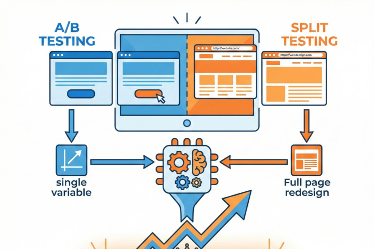
Even the most expertly designed product pages can improve through systematic testing. A/B testing removes guesswork by showing what actually works for your specific audience and products.
Testing prioritization focuses efforts on high-impact changes. Test elements that significantly influence purchase decisions first: primary product images, headline copy, CTA buttons, pricing display, and key trust signals. Minor typography changes or subtle color adjustments likely won’t move conversion rates materially.
Single-variable testing isolates what’s actually causing conversion changes. Testing multiple changes simultaneously makes it impossible to know which element drove results. Test one change at a time: button color, then button copy, then button placement. This methodical approach builds reliable knowledge about what works.
Statistical significance ensures you’re seeing real differences, not random variation. Small conversion rate changes from small traffic samples might be statistical noise. Let tests run until they reach statistical significance, which might mean days or weeks depending on your traffic volume. Jumping to conclusions from insufficient data leads to counterproductive changes.
Segment analysis reveals that different changes work for different customer groups. A change that increases conversions for new visitors might decrease conversions for returning customers. Mobile and desktop visitors might respond differently to the same change. Analyzing results by segment provides nuanced insights that overall numbers mask.
Testing hypotheses rather than random changes makes testing more efficient. Each test should address a specific theory about customer behavior. “Will showing customer photos increase conversions because they provide authentic social proof?” is a testable hypothesis. “Let’s try a green button” is shooting in the dark. Learning why something works helps you apply that insight more broadly.
Site Speed and Technical Performance
Technical performance directly impacts conversion rates. Even small delays in page load time significantly increase bounce rates and decrease conversions. Speed optimization is no longer optional for competitive e-commerce.
Image optimization provides the biggest speed improvements for most product pages. Large, unoptimized images are typically the primary performance bottleneck. Compressing images, using modern formats like WebP, implementing lazy loading for below-the-fold images, and serving appropriately sized images for different devices all dramatically improve speed without noticeable quality loss.
Code minimization removes unnecessary bloat from HTML, CSS, and JavaScript files. Whitespace, comments, and redundant code increase file sizes without adding functionality. Minification tools automatically strip this excess, reducing file sizes and improving load times. Combining multiple files where possible reduces the number of server requests needed to load a page.
Browser caching stores static resources on visitors’ devices so they don’t need to be downloaded again on subsequent pages or visits. Properly configured caching means returning visitors experience much faster page loads, improving their experience and increasing the likelihood of conversion.
Content delivery networks distribute your site across multiple servers worldwide, serving content from the location closest to each visitor. This geographical distribution reduces latency, especially for international visitors who might otherwise be accessing servers thousands of miles away.
Critical rendering path optimization prioritizes loading elements that impact initial page display. Above-the-fold content should load first, so visitors see something useful quickly even if below-the-fold content is still loading. This perceived speed is almost as important as actual speed, as visitors decide whether to wait based on how quickly they see useful content.
Accessibility and Inclusive Design
Accessibility isn’t just ethically important—it’s also good business. Making product pages usable for people with disabilities expands your potential customer base while improving the experience for all users.
Alternative text for images helps screen readers describe visual content to visually impaired users. Product images should have descriptive alt text that conveys what the image shows. Decorative images can use empty alt text to prevent unnecessary noise for screen reader users. This benefits all users, as alt text displays when images fail to load.
Keyboard navigation ensures product pages work without a mouse. All interactive elements—buttons, links, forms, image galleries—should be accessible via keyboard alone. This helps users with motor impairments, power users who prefer keyboard shortcuts, and anyone whose pointing device fails.
Color contrast makes text readable for users with visual impairments and in varied lighting conditions. Sufficient contrast between text and background ensures readability. This particularly matters for important elements like prices, CTAs, and key product features. Color alone shouldn’t convey critical information, as colorblind users might miss it.
Readable typography benefits everyone but is essential for users with reading difficulties. Adequate font size (at least 16px for body text), clear typefaces, appropriate line spacing, and reasonable line length all improve readability. Avoid pure white text on pure black backgrounds, as the high contrast can cause visual stress.
Form accessibility makes purchase completion possible for all users. Clear labels, error messages that explain how to fix problems, and appropriate input types (numeric keyboard for phone numbers) all reduce friction. Screen reader users should be able to complete checkout without seeing the screen.
Building Product Page Templates That Scale
For stores with dozens or hundreds of products, manually optimizing each product page isn’t feasible. Effective templates balance consistency with the flexibility needed for different product types.
Template hierarchy starts with a universal foundation that applies to all products—core layout, basic elements, and brand consistency. Category-level templates add elements specific to product types. Clothing might need size charts and fit guides; electronics need specifications and compatibility information. Individual products can then customize within these templates.
Modular design systems use reusable components that can be combined differently for various products. An image gallery module, specifications table module, review section module, and related products module can be arranged appropriately for each product type. This modular approach maintains consistency while allowing flexibility.
Dynamic content population pulls information from your product database to automatically fill template fields. Product names, prices, specifications, and other structured data don’t need manual entry for each page. This reduces errors, ensures consistency, and makes updating information across multiple products feasible.
Conditional logic shows or hides elements based on product attributes. Size charts only appear for products with size variations. Compatibility tables only display for products with compatibility considerations. This keeps pages focused on relevant information without cluttering them with inapplicable sections.
Customization flags let merchandisers override template defaults for special products. A featured product might need custom hero imagery or unique messaging. Holiday specials might display promotional banners. Templates should accommodate these exceptions without breaking the overall system.
Conclusion: The Path to Continuous Improvement
Product page optimization is never truly finished. Customer expectations evolve, competitors improve their pages, new technologies emerge, and your own product line changes. The most successful e-commerce businesses treat product page optimization as an ongoing process rather than a one-time project.
Start with the fundamentals: high-quality images, clear descriptions, transparent pricing, prominent CTAs, and trust signals. These basics matter more than advanced tactics. A product page with excellent fundamentals will outperform a technically sophisticated page that lacks clear images or straightforward information.
Use data to guide priorities. Analytics reveal where visitors spend time, where they exit, and what they click. Heat mapping shows what draws attention and what gets ignored. Customer feedback and support questions highlight confusion points and missing information. Let this data direct your optimization efforts toward changes that matter.
Author