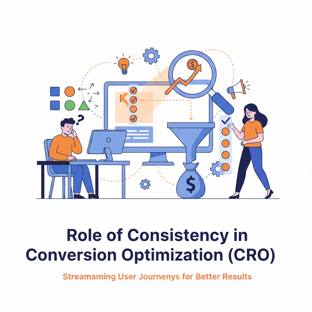
The Role of Consistency in Conversion Rate Optimization (CRO)
Why Unified Experiences Boost Trust, Engagement, and Conversions
📌 Table of Contents
Introduction to CRO and Why Consistency Matters
Understanding Consistency in CRO
Types of Consistency That Affect Conversions
Psychological Principles Supporting Consistency
Real-World Examples of Inconsistency Costing Conversions
Where to Ensure Consistency in the Funnel
The Impact of Inconsistency on Trust and UX
CRO Strategies to Maintain Consistency
Tools to Audit Consistency Across Your Website
Case Studies: Brands That Improved CRO via Consistency
Conclusion and Final Thoughts
1. 🎯 Introduction: Why Consistency Is Crucial for CRO
In Conversion Rate Optimization (CRO), the smallest misalignment — a button color that doesn’t match, a copy tone that shifts mid-journey, or a broken promise between ad and landing page — can cause doubt, friction, and drop-offs.
Consistency is the invisible thread that ties user experience (UX), trust, and decision-making together. Without it, even high-traffic pages can fail to convert.
This article explores how and why consistency is essential to CRO success in 2025, with strategies, examples, and actionable takeaways.
2. 🔍 What Is Consistency in CRO?
Consistency in CRO means creating a seamless, predictable, and aligned experience for users as they move through your website or funnel — from ad click to purchase or form fill.
It includes:
Visual consistency (design, layout, typography)
Messaging consistency (tone, offer, benefits)
Behavioral consistency (how users interact with buttons, navigation)
Functional consistency (what users expect vs. what they get)
Why It Matters:
Builds trust and professionalism
Reduces cognitive load
Reinforces brand identity
Encourages faster decision-making
Lowers bounce rate and exit rate
3. 🧱 5 Core Types of Consistency That Affect Conversions
| Type of Consistency | Description | Why It Matters |
|---|
| Visual | Colors, typography, spacing, design | Inconsistent visuals look unprofessional and confuse the user |
| Message | Offer clarity, tone, CTA | If the message changes mid-funnel, it can cause friction or mistrust |
| Branding | Logo usage, voice, taglines | Cohesive branding increases familiarity and trust |
| Functional/UX | Button behavior, navigation flow | Predictable interactions reduce friction |
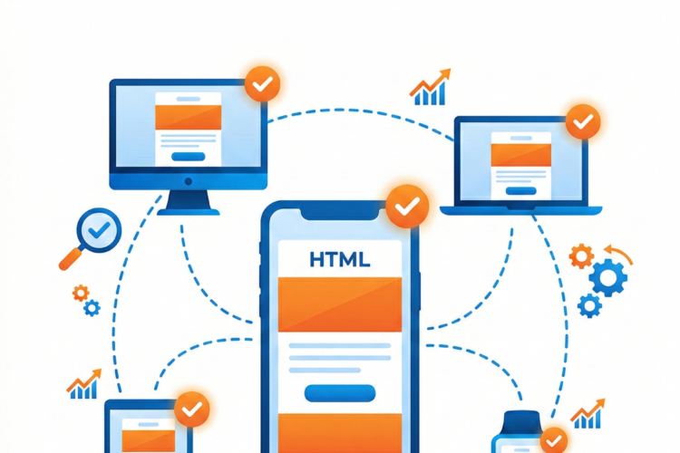
| Cross-Platform | Desktop, mobile, tablet UX | Users expect a consistent experience across all devices |
4. 🧠 Psychology of Consistency in Conversions
1. Cognitive Fluency
Humans are drawn to things that are easy to process. When your site maintains visual and messaging consistency, it feels intuitive. This lowers the cognitive effort to convert.
2. Trust and Expectation Alignment
Users expect a brand to deliver what it promises. Any inconsistency between ad and landing page breaks this psychological contract and reduces conversions.
3. Pattern Recognition
The brain loves familiarity and predictability. If your layout, CTA buttons, or colors change erratically, the brain must re-learn them. This increases drop-off.
5. 🚫 Examples of Inconsistency Killing CRO
Ad Mismatch
Ad Copy: “Get 30% Off Today Only”
Landing Page: “Sign up to get offers”
❌ Result: User feels misled → bounce
Button Color Changes
Mobile vs Desktop Confusion
Multiple CTAs With Different Messaging
“Buy Now”, “Get Started”, “Book a Demo” on same page
❌ Result: Choice paralysis → lower conversion
6. 🔄 Where to Maintain Consistency in Your Funnel
| Funnel Stage | What to Keep Consistent |
|---|
| Ad Campaigns | Headline, offer, tone, CTA |
| Landing Pages | Layout, colors, fonts, CTA design |
| Product Pages | Pricing structure, benefit statements |
| Forms | Field types, button behavior, trust signals |
| Checkout | Branding, tone, UX, security assurances |
| Follow-up Emails | Offer language, voice, visuals |
7. ⚠️ What Happens When You Break Consistency?
Loss of trust: Users think the brand is unreliable
Increased bounce rate: Users abandon when things “feel off”
Poor mobile experience: Inconsistencies across devices harm user flow
Confused visitors: Too many messages or design shifts reduce clarity
Lower conversion rates: Even small inconsistencies can create hesitation
8. 📈 CRO Strategies to Ensure Consistency
✅ 1. Use a Design System
Create a shared system of colors, fonts, buttons, spacing
Use components across your website and ads
✅ 2. Copywriting Templates
Maintain brand voice across blog, landing pages, ads, emails
Use consistent offer framing and CTA language
✅ 3. Align Ads with Landing Pages
Use the exact same headlines, visuals, and promises
Make landing page fulfill the ad promise immediately
✅ 4. Build Funnel-Wide Style Guides
Design + content teams align on tone, format, UX rules
Prevent “Frankenstein” pages that look stitched together
✅ 5. A/B Test for Message Consistency
9. 🛠 Tools to Audit and Maintain Consistency
Google Optimize – Test visual or copy changes
Hotjar / Clarity – Observe where users drop off from inconsistent UX
Figma / Adobe XD – Design system creation
Loom / Notion – Create internal CRO consistency documentation
BrowserStack – Test consistent display across devices
Weglot / Lokalise – For consistent multilingual experiences
10. 🧪 Case Study: CRO Boost from Consistency
🧴 Brand: Organic Skincare Company
Before:
Facebook ad promised “Free Sample Kit”
Landing page headline was “Join Our Newsletter”
CTA button changed colors on different pages
After:
Aligned ad copy and landing page message
Unified CTA button color across site
Simplified and matched layout styles
Results:
Bounce rate reduced by 22%
Form conversions increased by 37%
1.8x lift in ROAS from paid traffic
11. 🧭 Final Thoughts: Consistency = Confidence = Conversions
In the CRO world, consistency is not just a design best practice — it’s a trust-building strategy. When your messaging, visuals, and functionality align at every touchpoint, users feel confident, experience less friction, and are more likely to convert.
Golden Rule:
“If something looks different, it better behave the same. If something behaves differently, it better look different.”
By staying consistent across channels and funnel stages, you create a seamless journey — and in that journey lies the secret to higher conversions.