


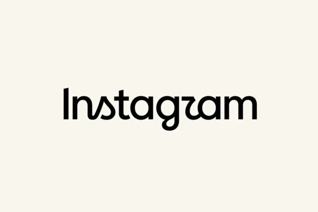
Instagram has unveiled a redesigned wordmark, marking the first major change to its text-based logo in nearly a decade. The familiar Instagram camera icon remains unchanged.
The new wordmark combines cursive and print-style lettering, giving the brand a cleaner and more modern appearance while retaining elements of Instagram’s original visual identity. Instagram says the refresh is designed to better reflect creativity, individuality and self-expression.
However, the redesign has quickly become a topic of discussion online. Some users feel the new lettering—particularly the “r”—is difficult to read, with many joking that the logo looks like “Instagzam.”
Instagram has also refreshed its broader typography system, including Instagram Sans, along with new typefaces such as Instagram Pen and Instagram Mono.
What This Means for Marketers
For brands and digital marketers, the update is a reminder that even established visual identities evolve. Businesses using Instagram branding across social media templates, websites, presentations, ads and marketing materials may want to review their brand assets and update the wordmark where appropriate.
The big question: Is Instagram’s new wordmark a modern evolution—or an unnecessary redesign?
#Instagram #InstagramLogo #SocialMediaMarketing #DigitalMarketing #Branding #SocialMediaNews