
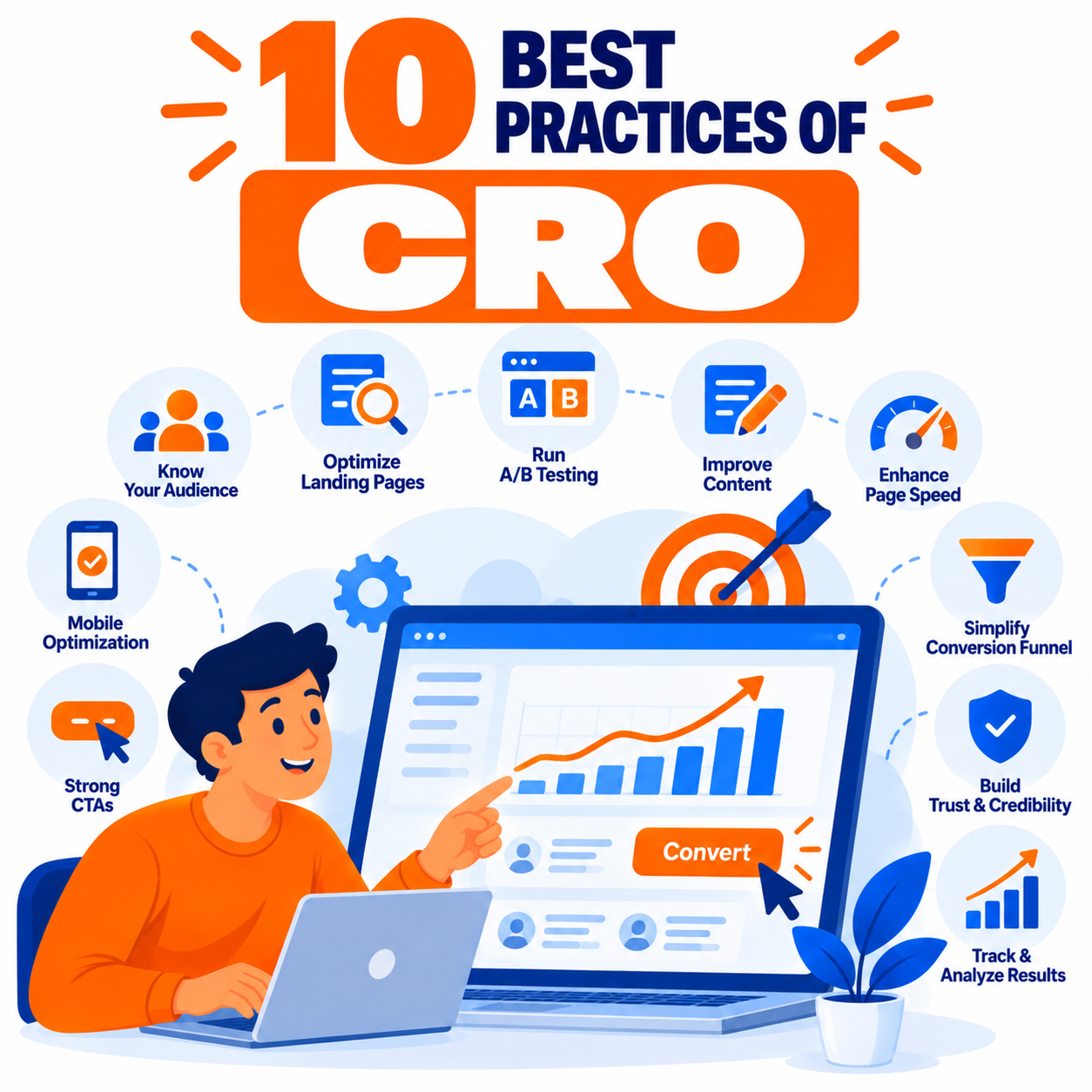
Conversion Rate Optimization (CRO) is the systematic process of increasing the percentage of website visitors who complete a desired action—whether that is making a purchase, filling out a form, signing up for a trial, downloading a resource, or booking a call. It is not about random design tweaks or copying competitors. Effective CRO combines user research, data analysis, psychology, testing discipline, and continuous iteration.
High-performing teams treat CRO as an ongoing program rather than a one-time project. The following ten best practices represent the foundational principles that consistently separate programs that deliver meaningful lift from those that produce noise and inconclusive results. Each practice is explained in depth, including why it matters, how to apply it, common pitfalls, and practical implementation guidance.
1. Start with Clear Goals and a Single Primary Conversion Metric
Every CRO effort must begin with precise definition of success. Without a clear primary conversion goal, teams optimize for vanity metrics, dilute focus across too many actions, or celebrate improvements that do not move the business.
Define the primary conversion (for example, completed purchase, qualified lead form submission, or free-trial activation). Support it with secondary metrics that explain the path (add-to-cart rate, form start rate, scroll depth, time to conversion). Align the primary metric with actual business value—revenue, qualified pipeline, or retention—rather than pure volume.
Document the goal, the pages or funnels that matter most, and the baseline conversion rate before any testing begins. This clarity prevents scope creep and ensures every hypothesis is judged against the outcome that matters.
Common mistake: Tracking dozens of micro-conversions with equal weight and losing sight of the one action that drives revenue or growth.
2. Build Decisions on User Research and Data, Not Opinions
Guesswork is the enemy of reliable CRO. The strongest programs combine quantitative data (analytics, heatmaps, session recordings, funnel drop-off reports) with qualitative insight (user surveys, customer interviews, usability testing, support ticket analysis, and on-page feedback tools).
Quantitative data reveals where problems occur. Qualitative data explains why. Together they generate higher-quality hypotheses. Review analytics for high-traffic, high-drop-off pages. Watch session recordings of users who abandon. Ask recent converters and non-converters what almost stopped them. Map the actual customer journey against the intended one.
Prioritize research on the pages and steps that carry the most traffic and the largest drop-offs. A well-researched hypothesis has a far higher chance of producing a true winner than a redesign based on internal preference.
Common mistake: Launching tests based solely on “I think the button should be bigger” or competitor screenshots without evidence from your own users.
3. Focus Ruthlessly on the User Experience and Friction Removal
Conversion is often limited more by friction than by lack of persuasion. Every unnecessary field, confusing label, slow load, unclear next step, or broken expectation reduces the likelihood of completion.
Conduct friction audits across the critical path: page speed, mobile usability, form length and clarity, error messaging, navigation distractions, trust gaps, and cognitive load. Simplify language. Reduce choices where possible (Hick’s Law). Make the primary action visually obvious. Ensure the page answers the visitor’s immediate questions in the order they arise.
Mobile experience deserves special attention—many sites still treat it as secondary even when the majority of traffic arrives on phones. Touch targets, readable text, fast loading, and thumb-friendly layouts are non-negotiable.
Common mistake: Adding more persuasive copy or design flourishes while leaving structural friction (long forms, slow pages, unclear CTAs) untouched.
4. Establish Strong Visual Hierarchy and a Clear Value Proposition Above the Fold
Visitors decide within seconds whether a page is relevant. The first viewport must communicate what is offered, who it is for, and why it matters, then present a clear next step.
Craft a specific, benefit-oriented headline. Support it with a concise subheadline or bullet points that address the primary job-to-be-done. Place a prominent, action-oriented call-to-action in a high-contrast position. Include one trust or relevance signal when possible (social proof, key metric, or risk reducer).
Avoid burying the value proposition below long hero images or decorative elements. Test message match between ads or emails and the landing page headline—mismatches create immediate bounce.
Common mistake: Clever but vague headlines, weak contrast on the primary CTA, or competing elements that dilute focus in the first screen.
5. Use Social Proof and Trust Signals Strategically Near Decision Points
People look to others when uncertain. Relevant, specific social proof reduces perceived risk and increases confidence at the moments it matters most—near the primary CTA, on pricing pages, and at checkout or form submission.
Effective proof includes customer logos, specific testimonials with names and results, star ratings, case study snippets, usage numbers, security badges, guarantees, and media mentions. Specificity outperforms generic praise. Place proof where hesitation peaks rather than only in a distant testimonials section.
Match the type of proof to the audience and offer. Enterprise buyers often respond to recognizable logos and detailed case studies; consumers may respond more to ratings and short authentic quotes.
Common mistake: Generic or outdated testimonials placed far from the conversion action, or overloading the page with so much proof that it creates clutter.
6. Optimize Calls-to-Action for Clarity, Contrast, and Motivation
The call-to-action is the moment of decision. Weak CTAs leak conversions even when the rest of the page is strong.
Use action-oriented, specific language that reinforces the value (“Start free trial,” “Get my guide,” “Book my demo”) rather than generic labels (“Submit,” “Click here”). Ensure high visual contrast against the background. Make the button large enough for easy interaction on mobile. Repeat the primary CTA at logical points for longer pages, but avoid multiple competing primary actions.
Test microcopy, color, size, placement, and surrounding reassurance text (for example, “No credit card required”). The best CTA feels like the natural, low-risk next step.
Common mistake: Low-contrast buttons, vague labels, or several equally prominent CTAs that create decision paralysis.
7. Reduce Form Friction and Progressive Engagement
Forms are frequent conversion killers. Every additional field has a cost. Ask only for information required at that stage. Use smart defaults, clear labels, inline validation, and helpful error messages. Consider multi-step forms for longer data collection so the first step feels easy.
For lead generation, progressive profiling (collecting more data over subsequent interactions) often outperforms long initial forms. Remove optional fields that are not essential. Make privacy and next-step expectations transparent.
Test form length, field order, and the presence of trust signals immediately beside the form.
Common mistake: Long forms that request unnecessary information upfront, poor mobile keyboard handling, or unclear error states that cause abandonment.
8. Run Disciplined A/B and Multivariate Tests with Proper Rigor
Testing is the engine of CRO, but only when executed with statistical and methodological discipline. Random changes without hypotheses, stopping tests too early, or ignoring segment differences produce misleading results.
Develop a clear hypothesis rooted in research (“Because we observed X, we believe changing Y will improve Z for this audience”). Test one primary variable at a time when possible so winners are interpretable. Determine sample size and runtime in advance. Avoid peeking and stopping at the first sign of significance. Document results, including losers, so learning compounds.
Segment results by device, traffic source, and new versus returning users when volume allows. A change that wins overall may lose for a key segment.
Common mistake: Ending tests at the first green result, testing too many elements simultaneously without sufficient traffic, or failing to implement and iterate on winners.
9. Prioritize Opportunities with Structured Frameworks
Not every idea deserves equal effort. High-performing teams use prioritization models such as PIE (Potential, Importance, Ease), ICE (Impact, Confidence, Ease), or more detailed scoring that factors in traffic volume, current conversion rate, and implementation cost.
Score hypotheses consistently. Focus first on high-traffic pages and steps with large drop-offs where even modest relative lifts produce meaningful absolute gains. Balance quick wins with larger structural tests. Maintain a prioritized backlog so the program never stalls for lack of ideas.
Revisit prioritization regularly as data and business goals evolve.
Common mistake: Working on low-traffic pages or pet projects while high-impact opportunities sit untouched, or constantly chasing new ideas instead of finishing and learning from current tests.
10. Treat CRO as a Continuous Program with Documentation and Iteration
Conversion optimization is not a project with an end date. Winning pages eventually face creative fatigue, traffic mix changes, competitive shifts, and rising user expectations. The highest returns come from compounding learning over time.
Maintain a testing calendar and hypothesis backlog. Document every test—hypothesis, screenshots, results, segments, and decisions—so institutional knowledge grows. Implement winners fully and cleanly. Feed insights back into research and design systems. Review overall funnel health periodically rather than only individual page tests.
Align CRO work with broader product, marketing, and analytics teams so insights influence messaging, offers, and experience design upstream.
Common mistake: Running a burst of tests, declaring victory, and then neglecting the program until conversion rates decline again.
Integrating the Ten Practices into a Working System
The practices reinforce one another. Clear goals focus research. Research generates better hypotheses. Hypotheses are prioritized and tested rigorously. Winners reduce friction and strengthen hierarchy, proof, and CTAs. Learning is documented and feeds the next cycle.
Begin by establishing baselines and instrumentation quality. Conduct an initial research sprint on key funnels. Build a prioritized backlog. Launch a steady cadence of tests rather than sporadic large redesigns. Measure both relative lift and absolute impact on business metrics. Over time, shift from fixing obvious friction to refining persuasion, personalization, and experience quality.
Final Thoughts
Strong CRO programs are characterized by curiosity about user behavior, discipline in testing, and persistence in iteration. They avoid the twin traps of opinion-driven redesigns and endless inconclusive experiments. By anchoring work in clear goals, real user insight, friction reduction, persuasive clarity, rigorous testing, and continuous learning, teams systematically raise conversion rates and create experiences that better serve both the business and its customers.
These ten best practices provide the operating system. Execution quality—how thoroughly research is done, how carefully tests are run, and how consistently winners are implemented—determines the size of the results. Start with the highest-impact opportunities, maintain methodological rigor, and treat every test as both a potential win and a source of lasting insight.

Author