
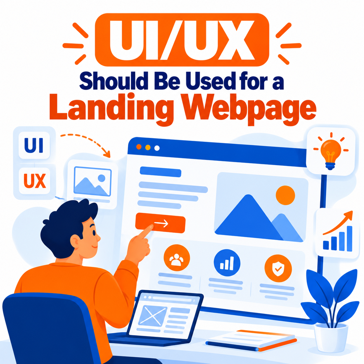
A landing page is not a regular website page. It is a focused conversion instrument designed around a single primary goal—whether that is capturing a lead, starting a free trial, making a purchase, booking a demo, or downloading a resource. The UI (visual design, layout, components) and UX (user experience, flow, clarity, friction) must therefore be optimized for decision-making speed, trust, and action rather than exploration or multi-path navigation.
There is no single universal “type” of UI/UX that works for every landing page. The right approach depends on the offer, audience, traffic source, and conversion goal. However, high-performing landing pages share a consistent set of principles, structural patterns, and design decisions that dramatically outperform generic or homepage-style designs.
This guide explains the recommended UI/UX philosophy for landing pages, the core principles that drive conversions, the main structural types and patterns, detailed design and interaction guidelines, mobile and accessibility considerations, psychological factors, common mistakes, and how to choose and refine the right approach for your specific case.
Core Philosophy: Conversion-Focused, Single-Goal UI/UX
The fundamental type of UI/UX required for landing pages is conversion-centered design. Unlike a homepage (which orients many audiences and offers multiple paths) or a content page (which prioritizes information depth), a landing page deliberately removes distractions and guides the visitor toward one clear action.
Key characteristics of this approach:
- One primary goal and one dominant call-to-action (CTA)
- Minimal or no global navigation
- Strong visual hierarchy that answers visitor questions in order
- Message match with the traffic source (ad, email, social post)
- Rapid comprehension of value
- Progressive trust-building and objection handling
- Low friction on the path to conversion
- Mobile-first experience
- Fast performance and visual stability
Everything on the page should either support the conversion or be removed.
Foundational UI/UX Principles for Landing Pages
1. Clarity over cleverness
Visitors should understand what is being offered, who it is for, and what to do next within a few seconds. Vague or overly creative headlines that prioritize style over meaning reduce conversions.
2. Single focus and reduced choice
Hick’s Law applies strongly: more options slow decisions. One primary CTA (repeated at logical points) consistently outperforms pages with multiple competing actions.
3. Strong visual hierarchy
Guide the eye deliberately: headline → supporting value statement → primary CTA → supporting visual or proof. Use size, contrast, spacing, and position to create a clear scanning path (often F-pattern or Z-pattern influenced).
4. Message match
The headline, visuals, and offer on the landing page should closely reflect the promise made in the ad, email, or link that brought the visitor. Mismatches create immediate distrust and bounce.
5. Benefit-led communication
Lead with outcomes the visitor cares about, then support with features or proof. People buy results, not feature lists.
6. Trust and social proof near decision points
Place credible proof (logos, testimonials, metrics, guarantees, reviews) where hesitation is highest—near the hero CTA and again near the final conversion point.
7. Friction reduction
Minimize form fields, eliminate unnecessary steps, make the next action obvious, and remove anything that competes with the primary goal.
8. Speed and performance as UX
Pages that load quickly and remain visually stable convert significantly better. Core Web Vitals (especially LCP, INP, CLS) are conversion factors, not just technical metrics.
9. Mobile-first design
A large share of traffic arrives on mobile. Design the conversion path for small screens first, then enhance for larger viewports.
10. Accessibility and inclusive design
Clear contrast, readable typography, proper focus states, alt text, and keyboard usability improve both compliance and conversion by making the page usable for more people.
Recommended Structural Patterns and “Types” of Landing Page UI/UX
While the underlying principles stay consistent, the visual and structural “type” can vary:
Hero-driven / Product-as-Hero
Large visual (product screenshot, interface demo, lifestyle image, or short video) dominates the above-the-fold area alongside a clear headline and CTA. Highly effective for SaaS and products that benefit from demonstration.
Text-and-Proof Focused
Clean typography, strong headline, concise supporting copy, and prominent social proof or metrics. Works well when the offer is conceptually clear or brand recognition is high.
Long-Form Narrative / Story-Driven
Longer scrolling pages that build the case section by section (problem → solution → benefits → proof → how it works → objections → final CTA). Suitable for higher-consideration offers, complex products, or colder traffic.
Squeeze / Minimal Lead-Capture
Extremely focused pages with almost nothing except headline, short benefit statement, and a simple form or email capture. Used for high-intent lead magnets or waitlists.
Click-Through / Warm-Up Pages
Designed to educate or build desire before sending the visitor to a checkout, signup, or secondary conversion page. Emphasizes value and removes navigation while keeping the path short.
Hybrid or Modular Sections
Most modern high-converting pages use a modular sequence: Hero → Social proof bar → Benefits/Features (outcome-focused) → How it works → Deeper proof or case studies → Objection handling/FAQ → Final CTA. This is the dominant practical pattern.
The best choice depends on traffic temperature, offer complexity, and average order or lead value. High-intent traffic can succeed with shorter pages; colder or more complex offers often need more persuasion and proof.
Detailed UI Elements and UX Guidelines
Above the fold (first viewport)
Must communicate:
- What the offer is
- Who it is for / primary benefit
- Clear next action (CTA)
- At least one trust or relevance signal when possible
Headline and subheadline
Specific, benefit-oriented, and matched to visitor intent. Avoid jargon and vague claims.
Primary CTA
High contrast, action-oriented language (“Start free trial,” “Get the guide,” “Book my demo”), large enough touch target, repeated at logical intervals. Secondary CTAs should be visually subordinate or removed.
Visuals
Show the product in context, real outcomes, or relatable human situations. Avoid generic stock imagery that adds no meaning. Short product demos or interface previews often outperform abstract graphics for software.
Forms
Ask only for information needed at that stage. Progressive profiling or multi-step forms can reduce perceived friction for longer data collection. Clear labels, inline validation, and mobile-friendly inputs are essential.
Social proof and trust signals
Customer logos, specific testimonials with names/roles/results, star ratings, case study snippets, security badges, guarantees, and usage metrics. Place them where they reduce anxiety.
Typography and spacing
Readable font sizes, strong hierarchy, generous but purposeful white space, and scannable short paragraphs or bullets. Overly dense text increases cognitive load.
Color and contrast
Use brand colors strategically. Ensure the CTA stands out sharply from its background. Maintain accessible contrast ratios.
Micro-interactions and motion
Subtle, purposeful motion (hover states, gentle reveals, short autoplay demos with controls) can guide attention. Avoid decorative animations that distract or harm performance.
Mobile UX Specifics
- Stack content vertically
- Keep primary CTA visible or easily reachable
- Large tap targets (minimum ~44×44 px)
- Avoid hover-dependent interactions
- Optimize images and scripts aggressively
- Test the full conversion path on real devices
Psychological and Behavioral Considerations
Effective landing page UI/UX leverages:
- Visual salience (contrast and position)
- Cognitive ease (clear language and hierarchy)
- Social proof and authority
- Loss aversion and risk reversal (guarantees, trials)
- Progressive disclosure (reveal information as needed)
- Consistency and message continuity from the acquisition channel
Urgency and scarcity can help when genuine; manufactured urgency often damages trust.
Common UI/UX Mistakes That Kill Conversions
- Multiple competing goals or CTAs
- Weak or clever-but-unclear headlines
- Full website navigation on a dedicated landing page
- Slow load times or layout shifts
- Generic stock photos with no relevance
- Forms that ask for too much too soon
- Proof placed too far from decision points
- Poor mobile experience
- Ignoring message match with ads or emails
- Over-designing at the expense of clarity
How to Choose and Refine the Right UI/UX for Your Landing Page
- Define the single conversion goal precisely.
- Understand traffic source and intent level.
- Map the visitor’s questions in sequence and answer them with structure.
- Choose a structural pattern (hero-driven, long-form, minimal, etc.) that matches complexity and intent.
- Design mobile-first with clear hierarchy and one dominant CTA.
- Incorporate credible proof and friction-reducing elements.
- Ensure technical performance and accessibility.
- Test high-impact elements (headline, CTA, form length, proof placement, hero visual) systematically.
- Iterate based on quantitative data (conversion rate, scroll depth, form starts) and qualitative insights (session recordings, heatmaps, user feedback).
Conclusion
The optimal UI/UX for a landing webpage is conversion-centered, single-minded, and ruthlessly clear. It prioritizes rapid understanding of value, strong visual hierarchy, message match, trust-building at decision points, minimal friction, mobile excellence, and fast performance. While visual style can range from bold product-as-hero demonstrations to clean typographic minimalism or longer narrative storytelling, the underlying experience must always guide the visitor toward one primary action with as little resistance as possible.
Great landing page UI/UX does not try to impress with complexity. It removes obstacles, answers questions in the right order, makes the desired action obvious, and earns trust quickly. When these principles are applied consistently and refined through testing, landing pages become reliable conversion systems rather than decorative destinations. Start with clarity and focus, support them with proof and performance, and let data guide the refinements.

Author