
In Conversion Rate Optimization (CRO), few ideas have been as widely repeated—and as frequently misunderstood—as the concept of “3-Click Conversion.” Rooted in the classic Three-Click Rule of web design, the idea suggests that users should be able to complete a key task or reach desired information in no more than three clicks. In a CRO context, this translates into designing conversion paths (from landing page or homepage to purchase, signup, lead submission, or other goal) that are as short and frictionless as possible.
While rigorous usability research has largely debunked the Three-Click Rule as a rigid law, its underlying principle remains highly relevant: every unnecessary click, form field, or decision point increases cognitive load and abandonment risk. Modern CRO does not obsess over an exact number of clicks. Instead, it focuses on minimizing friction, maximizing clarity at every step, and ensuring that each interaction moves the user confidently closer to conversion.
This comprehensive guide explores the origins of the 3-Click concept, its strengths and limitations, how to apply low-click thinking to real conversion funnels, practical tactics for eCommerce, SaaS, and lead generation, when additional steps actually help, measurement approaches, testing strategies, and a modern framework that replaces rigid click-counting with user success metrics.
Origins and Definition of the Three-Click Rule
The Three-Click Rule emerged in the early 2000s as an informal web design heuristic. Popularized in part by Jeffrey Zeldman and widely circulated in design communities, it stated that a user should be able to find any information on a website within three mouse clicks from the homepage. The assumption was that users become frustrated and leave if the path is longer.
The rule was never based on robust empirical data. It was more of a memorable guideline intended to encourage clear information architecture and intuitive navigation. Over time, it was extended beyond “finding information” to completing tasks—hence the idea of “3-Click Conversion.”
What Research Actually Shows
Usability experts, including those at Nielsen Norman Group, have challenged the rule. Studies found that the raw number of clicks does not strongly correlate with user satisfaction or task success. In one notable example discussed by Jakob Nielsen, making product pages four clicks from the homepage (instead of three) improved users’ ability to find products by 600% because the intermediate steps provided better organization and clearer choices.
What matters far more than the absolute number of clicks is:
- Information scent — Does each click feel like progress toward the goal?
- Clarity and confidence — Does the user understand where they are and what will happen next?
- Perceived effort — Does the path feel simple even if it contains several steps?
- Task success rate — Can users complete the goal without confusion or errors?
In short, three clear, purposeful clicks almost always outperform one confusing click or five disorienting ones. The spirit of reducing friction is valuable; the rigid “must be three or fewer” interpretation is not.
Why Low-Click Thinking Still Matters in CRO
Even though the exact number is arbitrary, conversion paths with excessive steps leak users at every stage. Each additional click or form field introduces:
- Opportunity for distraction or second thoughts
- Cognitive load and decision fatigue
- Higher chance of technical or usability errors
- Increased abandonment, especially on mobile
Baymard Institute research on eCommerce checkout has repeatedly shown that solvable usability issues (many related to unnecessary steps, unclear progress, or form friction) contribute significantly to the roughly 70% average cart abandonment rate. Reducing unnecessary interactions is one of the highest-leverage ways to improve conversion rates without increasing traffic.
Applying 3-Click (Low-Friction) Principles to Conversion Paths
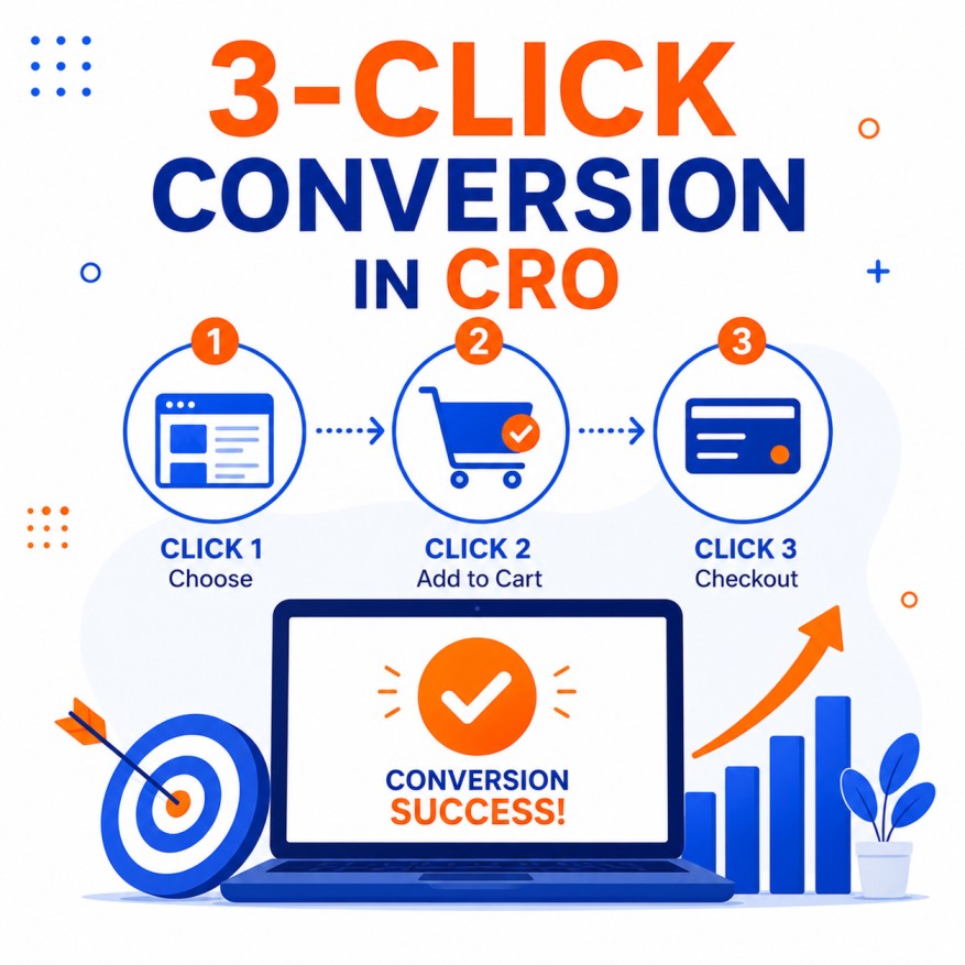
In practice, “3-Click Conversion” in CRO means designing the primary path so that a motivated user can go from entry point to completed conversion with minimal steps. Idealized examples include:
E-commerce product purchase (simplified):
- Land on product page (or category → product)
- Add to cart / Buy now
- Complete checkout (guest checkout, minimal fields, express payment options)
SaaS free trial or signup:
- Land on landing page
- Click primary CTA
- Submit short form or authenticate via social/Google
Lead generation:
- Land on offer page
- Click CTA
- Complete short form
The goal is not always literally three clicks from the homepage of a large site, but rather the shortest sensible path from the user’s current context to the conversion event.
Practical Strategies to Shorten and Simplify Conversion Paths
1. Reduce steps in the core funnel Map every click and form field from landing to conversion. Eliminate or combine steps that do not add necessary value or information. Guest checkout, one-page checkout, and express payment methods (Shop Pay, Apple Pay, Google Pay, PayPal) are classic examples of step reduction that lift conversion.
2. Minimize form fields Every field is a barrier. Ask only for information required to complete the transaction or begin the relationship. Use progressive profiling to collect additional data later. Smart defaults, autofill, and address lookup tools further reduce effort.
3. Strengthen information scent and visual hierarchy Make the next step obvious. Primary CTAs should be highly visible, benefit-oriented, and repeated at logical decision points. Users should never wonder “What do I do next?”
4. Remove competing actions and navigation on conversion-focused pages Landing pages and checkout flows perform better when exit routes (main navigation, unrelated links, secondary offers) are minimized or removed. This keeps attention on the primary goal.
5. Optimize for mobile-first interaction On mobile, each tap carries higher interaction cost. Large touch targets, thumb-friendly placement, minimal typing, and streamlined flows are essential. Many “extra clicks” feel especially painful on small screens.
6. Use smart defaults and acceleration features Pre-select common options, remember returning users, offer one-click reordering, and leverage browser autofill and password managers. Amazon’s 1-Click ordering is the extreme (and patented) expression of this principle.
7. Provide clear progress indication when multiple steps are necessary When a process legitimately requires several steps (complex configuration, multi-stage applications, detailed checkouts), use progress bars, step labels, and reassurance so users feel momentum rather than uncertainty.
When More Than Three Clicks Is Actually Better
Rigid adherence to three clicks can harm usability and conversion in certain situations:
- Complex products that require configuration or education
- High-consideration purchases where users need comparison, reviews, or detailed specifications
- Processes that benefit from progressive disclosure (breaking a long form into logical, less intimidating steps)
- Power-user or enterprise tools where precision and control outweigh speed
In these cases, additional steps that build confidence, reduce errors, or allow meaningful choices improve both success rates and satisfaction. The key is that every extra click must earn its place by providing clarity or value.
Measuring and Diagnosing Click-Related Friction
Move beyond simply counting clicks:
- Funnel visualization showing drop-off at each step
- Form analytics (field-level abandonment and error rates)
- Session recordings and heatmaps to observe hesitation and rage clicks
- Time-to-conversion and task success rates from user testing
- Device- and source-segmented analysis (mobile paths are often longer and more fragile)
- Qualitative feedback (“What almost stopped you from completing [action]?”)
Identify the steps with the highest absolute drop-off and the lowest success rates—these are your priority opportunities.
Testing Low-Friction Improvements
Common high-impact tests include:
- Single-page vs. multi-step checkout
- Number of form fields
- Guest checkout vs. forced account creation
- Express payment options
- CTA copy, placement, and repetition
- Removal of navigation on landing pages
- Progress indicators vs. no indicators on multi-step flows
Always tie tests to business metrics (conversion rate, revenue per visitor, form completion rate) rather than intermediate click counts alone.
Common Mistakes When Pursuing 3-Click Conversion
- Obsessing over the number three instead of overall task success and clarity
- Flattening information architecture so severely that users cannot find or compare options
- Removing necessary reassurance or information in the name of fewer clicks
- Ignoring mobile interaction costs
- Failing to test whether a longer but clearer path outperforms a shorter but confusing one
- Applying homepage-to-anywhere thinking to deep conversion funnels where context differs
A Modern Framework to Replace Rigid Click Counting
Instead of enforcing a three-click maximum, adopt these principles:
- Map the real user journey and quantify friction at each step.
- Maximize information scent so every interaction feels purposeful.
- Minimize required effort (clicks, taps, typing, decisions) while preserving necessary clarity and confidence.
- Optimize for task success and confidence, not arbitrary interaction counts.
- Segment by device, intent, and user type—the ideal path often differs.
- Test and iterate based on behavioral data and business outcomes.
Conclusion
The idea of 3-Click Conversion captures an enduring truth in CRO: friction kills conversions. While the original Three-Click Rule is more myth than scientific law, the discipline of scrutinizing every step between a visitor’s arrival and the desired action remains one of the most powerful levers available.
Successful teams do not count clicks dogmatically. They relentlessly remove unnecessary ones, strengthen the clarity and confidence of those that remain, and ensure that motivated users can convert with minimal effort and maximum certainty. Whether the final path contains two, three, four, or five interactions matters far less than whether each one feels inevitable, easy, and worthwhile.
Audit your primary conversion paths today. Count the clicks and fields, watch real users attempt the journey, measure the drop-offs, and systematically eliminate everything that does not earn its place. The result is not merely fewer clicks—it is higher conversion rates, better user experiences, and more efficient growth.

Author